Typography Task1/Exercise
24.9.2024-28.10.2024/week1-week5
Cai Zihan/0378043
Typography/Bachelor of Design (Honours) in Creative Media
Task1:Exercise1
TABLE OF CONTENTS
1.LECTURES
LECTURES
Week1:
face to face lectures:
Mr.Vinod clearly tell us the rules of the class rules and how to create a blog.Mr.Vinod gave us a link to see how to create a student's e-profile.Task1:we need to watch eportfolio briefing and make six pictures from Mr.Vinod .
Lecture 0 and 1 online lectures:
Typography :the style and appearance of printed matter.
Mr.Vinod recommended a URL:fonts.com
Mr. Vinod let's take a look at the properties that come with the development of typography and the influence that skills and thinking have.
 |
| Fig.1.1. Tmrminology |
Mr.Vinod introudeced the history of the development of fonts:
Early letter form-Hand script-Black letter to Gutenberg's type-Humanist script to roman type-Duth printing-Text type classification
Got to know one of the fonts."t"and"r" is connected.
Typography has evolved over 500 years:calligraphy letteringTypography.And like any craft that has been developed over time,item ploys a number of terminologies,conventions and unwritten rules depending on your disposition or influences with regard to style.
 |
| Fig.1.3. Different Font |
 |
| Fig.1.4. Phoenicion to Roman |
The Greeks changed the direction of writing.Phoenicians,like other Semitic peoples,wrote from right to left.The Greek developed a styleof writing called 'boustrophedon'(how the ox ploughs),which meant that the lines of text read alternately from right to left and left to right.As they change the direction of reading they also changed the orientation of the letter forms.
Week2:
face to face:
Mr.Vinod commented on our homework from last week.He said don't overdo it with graphic elements.We need to be intergrated with the meaning of the word more vividly.Then he taught us some simply use of Ai software.
Lecture 3 online lectures:
Text/Tracking:Kerning and Letterspacing
The term'kerning'refers to the automatic adjustment of spacebetween letters.It is often mistakenly referred to as 'letterspacingInfact,letterspacing means to add space between the letters.Theaddition and removal of space in a word or sentence is referred to as‘tracking’.
 |
| Fig.2.1. Kerning and Letterspacing |
Use Ai's shortcuts:
shift+Ctrl+. The font size become larger
shift+Ctrl+, The font size become smaller
shift+Ctrl+【/】 Kerning fine-tuning
 |
| Fig.2.2. normal tracking,loose tracking and tight tracking |
The spacing of fonts can affect normal reading.
 |
| Fig.2.3. Flush left |
The thickness of the font can increase the readability of the article.
Fonts that are too long will reduce readability.
The colors are darker can increase the readability of the article.
 |
| Fig.2.6. x-hight |
x-hight will be more readable.
Type size:Text type should be large enough to be read easily atarms length-imagine yourself holding a book in your lap.Leading:Text that is set too tightly encourages vertical eyemovement;a reader can easily loose his or her place.Type that is set to loosely creates striped patterns that distract the reader from them aterial at hand.Line
Length:Appropriate leading for text is as much a function of the line length as it is a question of type size and leading.Shorter lines require less leading;longer lines more.A good rule of thumb is to keep line length between 55-65 characters.Extremely long or short lines lengths impairs reading
Week3:
face to face:
Mr.Vinod again evaluated our assignments and told us what we needed to improve.'Rush''s 'ush' can be capitalized.'Pull' can reduce the thickness.'wind'and'chop' is well.
Lectures 4 Text-part 2
In the lesson,Mr.Vinod let us watch a video on how to make an animation.The leading space is between two sentences. Line spacing takes into account the baseline, the baseline of one sentence to the descending portion of the rising portion of another sentence.
 |
| Fig.3.2. Difference between line spacing and leading |
In traditional typesetting (the kind that still endures among conscientious commercial publishers),there are two unpardonable gaffes-widows and orphans.Designers(specifically those that deal with large amounts of text in websites or books on online magazines or printed magazines,news papers or online journals)must take great care to avoid the occurrence of the the above mentioned.
A widow is a short line of type left alone at the end of a column of text.
An orphan is a short line of type left alone at the start of new column.
 |
| Fig.3.3. Widow and Orphan |
In justified text both widows and orphans are considered serious gaffes.Flush right and ragged left text is some what more forgiving towards widows,but only a bit.Orphans remain unpardonable.
The only solution to widows is to rebreak your line endings throughout your paragraph so that the last line of any paragraph is not noticeably short.
 |
| Fig.3.4. serif typeface |
Quotation marks,like bullets,can create a clear indent,breaking the left reading axis.Compare the indented quote at the top with the extended quote at the bottom.
Cross aligning headlines and captions with text type reinforces the architectural sense of the page-the structure-while articulating the complimentary vertical rhythms.In this example,four lines of caption type (leaded 9 pts.)cross-align with three lines of text type (leaded to13.5pts)
week 4:
face to face:
Mr.Vinod commented on our animation homework and the problem with my homework is that I still need to continue with the after part, i.e. it's incomplete. wind's i can fall down and go in slow motion.
online:
Typo-2-Basic
Typography:Basic/Describing letterforms
Baseline The imaginary line the visual base of the letterforms.
Median The imaginary line defining the x-height of letterforms.
X-height The height in any typeface of the lowercase 'x'.
Punctuation,miscellaneous characters Although all fonts containstandard punctuation marks,miscellaneous characters can changefrom typeface to typeface.It's important to be acquainted with all thecharacters available in a typeface before you choose the appropriatetype for a particular job.
week 5:
face to face
The professor pointed out our problems with last week's assignment in class, and my problem was that there were too many gaps between paragraphs, the paragraphs were a little untidy, and I could have left some space at the bottom of the essay.
online:
Typo 5-Understanding
Typography:Letter/Understanding letterforms
The uppercase letter forms below suggest symmetry,but in fact itnot symmetrical.It is easy to see the two different stroke weights ofthe Baskerville stroke form(below);more noteworthy is the fact thaeach bracket connecting the serif to the stem has a unique arc.
As you already know,the x-height generally describe the size of thelowercase letterforms.However,you should keep in mind that curvedstrokes,such as in 's',must rise above the median (or sink below thebaseline)in order to appear to be the same size as the vertical andhorizontal strokes they adjoin.
 |
| Fig.5.4. x-height |
Improtant
 |
| Fig.5.5. Improtant |
INSTRUCTIONS
<iframe src="https://drive.google.com/file/d/1pmDu-d1Anjq54Eniu-t3MuRe2eR2rria/preview" width="640" height="480" allow="autoplay"></iframe>
Task1:Exercise -Type Expression
week1:we need to make six pictures that match the meaning of the word.
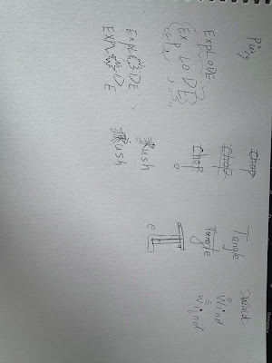
The word is:Pull,Explode,Chop,Rush,Wind,Tangle.
Here's a picture I found online as inspiration.
 |
| fig.7.1 |
 |
| Fig.7.2. Sketch of my Expressions |
sktch
Final Type Expressions
 |
| Fig.7.4. The process of creating an animation |
Here's the process I went through to create the wind animation, which made about 14 drawings. Break out each frame in more detail.
Final Type Expressions
This is a correction made after the teacher's evaluation.Made it look like the dot on the i fell off the screen and the wind blew it away.
week 4
make a text
HEAD
Font/s: Bembo Std
Type Size/s: 24 pt
Leading: 24 pt
Paragraph spacing: 0
BODY
Font/s: Bembo Std Bold
Type Size/s: 10 pt
Leading: 11 pt
Paragraph spacing: 11 pt
Characters per-line: 60
Alignment: left justified
Margins: 89 mm top, 98 mm left + right + bottom
Columns: 2
Gutter: 10 mm
 |
| Fig.7.7. The process of creating a text format |
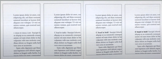
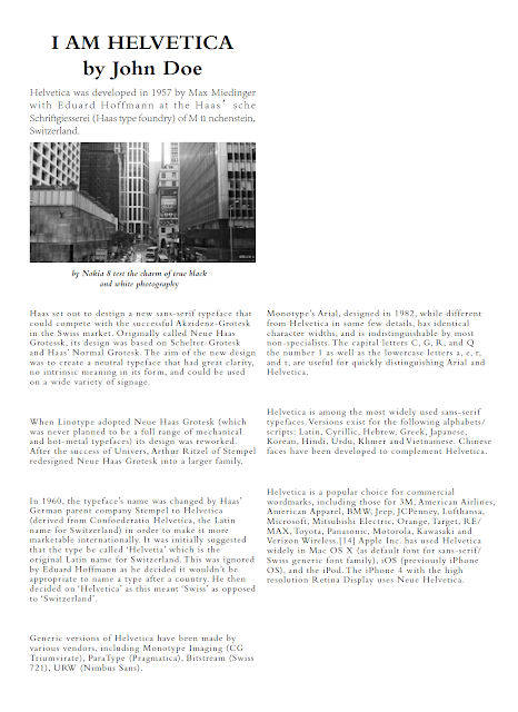
This is the process of doing this week's homework, the first time to do text formatting, or very rusty, although the teacher gave a very detailed explanation of the video, but I still have to find half a day where the tools, this assignment took me a long time to complete, the final form is this.
Overall there is still a bit of a problem so the teacher pointed out to us what the problem was, and here is what I did after revising it.
Final Type Expressions
week 5
Here's the process of making a headline.
 |
| Fig.7.10. Headline |
Some of this text changes font, spacing three times and ends up looking like this.
 |
 |
| fig.7.11 |
This was the title at the beginning, and the professor said that 'CODE' could have been separated a bit, it was too compact and interfered with the reading.
 |
| fig. 7.12 |
FEEDBACK
Week 1
General Feedback:I learnt about the rules and instructions.And also,I learnt a clear explanation of how to create a blog.
Week 2
General Feedback :Mr. Vinod commented on our homework from last week.He said don't overdo it with graphic elements.We need to be integrated with the meaning of the word to express the meaning of the word more vividly.Then taught us the use of Ai software simply
Week 3
Specific Feedback:'Rush''s 'ush' can be capitalized.'Pull' can reduce the thickness.'wind'and'chop' is well.
General Feedback :Mr. Vinod again evaluated our assignments and told us what we needed to improve.The professor sent us a video on how to make an animation, which we needed to learn in advance and make a small animation.
Week 4
Specific Feedback:Mr.Vinod commented on our animation homework and the problem with my homework is that I still need to continue with the after part, i.e. it's incomplete. wind's i can fall down and go in slow motion.
week 5
Specific Feedback:The professor pointed out our problems with last week's assignment in class, and my problem was that there were too many gaps between paragraphs, the paragraphs were a little untidy, and I could have left some space at the bottom of the essay.
General Feedback:The teacher reviews our text work from last week in class and has us revise it in class and print it in class. At the end of class, we were given an explanation of this week's homework and told to submit the blogs we have written over the weeks by the 28th.
REFLLECTIONS
week 1:
Experience:
I learnt about the rules and instructions.And also,I learnt a clear explanation of how to create a blog. This is a whole new process for me because I've never used a blog before, so I'll be watching the video the instructor posted several times.
Observations:
Since this is my first time using a blog, I will watch a video given by my teacher over and over again. And the biggest difficulty was to create a dividing line with the code, I tried several times but for some reason every time I wanted to continue typing the following text, it would jump to the top of the dividing line, I ended up hand-typing this code to accomplish it.
Findings:
Facing a new thing will be difficult, but don't give up when you encounter difficulties, try a few more times and you will understand.
week 2:
Experience:
This week our teacher had us create six pieces that matched the meaning of the words and critiqued our work during class. The teacher's critiques were very to the point and we were quickly able to identify our shortcomings and improve on them.
Observations:
The first time I made it was still very green and a bit ignorant, but after looking at the finished products of some seniors or other biographers I got my own ideas and made it.
Findings:
I still need to see and do more, learn more about the thoughts and ideas of other people's creations and to conceptualize my own, and practice more.
week 3:
Experience:
Mr. Vinod again evaluated our assignments and told us what we needed to improve.The professor sent us a video on how to make an animation, which we needed to learn in advance and make a small animation.
Rush''s 'ush' can be capitalized.'Pull' can reduce the thickness.'wind'and'chop' is well.
Observations:
After the teacher's critique in the last class I continued to improve my work and selected the better four pieces for the teacher's critique, which still had a few minor issues that needed improvement.
Findings:
I need to be a little more detailed in my work, and I end up with a little bit of deficiencies that need to be improved and should need to be avoided.
week 4:
Experience:
Mr.Vinod commented on our animation homework and the problem with my homework is that I still need to continue with the after part, i.e. it's incomplete. wind's i can fall down and go in slow motion.
Observations:
If it needs to get better, it needs more practice. Making an animation needs to be followed through to the end, not made halfway, and needs to be looked at more closely.
Findings:
Still need to practice harder, observe other people's work and conceptualize my own ideas.
week 5:
Experience:
The professor pointed out our problems with last week's assignment in class, and my problem was that there were too many gaps between paragraphs, the paragraphs were a little untidy, and I could have left some space at the bottom of the essay.At the end of class, we were given an explanation of this week's homework and told to submit the blogs we have written over the weeks by the 28th.
Observations:
Text formatting is a very delicate modification that needs to be modified all the time and in conjunction with the overall layout.
Findings:
The need for more ideas and creativity requires reading more and more, accumulating and appreciating the ideas of others.
FURTHER READING
book:Typography Referenced
 |
| Fig.8.1. Typography Referenced |
Typography Referenced is a comprehensive reference book on typography design. It covers the basic principles of typography, history, font selection, layout techniques, and design strategies. The book not only discusses the classification and characteristics of fonts, but also provides practical design suggestions and case studies to help designers better understand and apply typography. With rich illustrations and examples, readers can get inspired and improve their typography skills. This book is suitable for beginners and experienced designers alike as a reference for typography design.
 |
| Fig.8.2. The development of fonts |
Reading this book I probably learned about the development of fonts in different periods, each period of time fonts have their own characteristics, continue to change over the years to have so many fonts that we use now.
 |
| Fig.8.3. Letters,Lines,and paragraphys |
Typeforms are inextricably linked to writing. Not calligraphy, the craft of exploring expression with hand-
rendered forms, but writing in the widest possible sense, from graffi ti to a hasty “back in fi ve minutes” sign
to the most elaborate piece of public lettering. These forms determine the fundamental relationships between
strokes and empty space at the heart of typeface design. On top of these, the designer adds a layer of interpretation
and elaboration, making unknown combinations of typeforms with consistent texture and adding stylistic
cues. Even the most constructed of typefaces hints at the underlying rhythm of manual mark-making.
 |
| Fig.8.4. Tools and Concepts |


Comments
Post a Comment