<iframe src="https://drive.google.com/file/d/1cRM_m5eErYToYALYb7Dm0RNrArnWh8I-/preview" width="640" height="480" allow="autoplay"></iframe>
Exercise 1 Web Analysis
What To Have in The Analysis:
Consider the purpose and goals of the website, and evaluate whether they are effectively communicated to the user.
Evaluate the visual design and layout of the website, including its use of color, typography, and imagery. Consider the functionality and usability of the website, including its navigation, forms, and interactive elements. Evaluate the quality and relevance of the website's content, including its accuracy, clarity, and organization. Consider the website's performance, including its load times, responsiveness, and compatibility with different devices and browsers.
Deliverables:
Write a brief report summarizing in not less than 200 words for each website analysis. You can include a screen capture of each section or page of the website to explain. Make sure that the formatting of the report is clear (heading/subheadings)
We were given several options for the websites provided by Mr Shamsul.
Choose Website
warhol-arts.webflow.io/
 |
| Fig 1.1 Warhol home page |
Visual Design and Layout:
This is a design site showcasing Warhol's work. This site is very design-oriented, and the first page can be found by moving the mouse to reveal that the characters in the background move and patterns appear for each letter of ‘WARHOL’.
The site uses black as a background with a lot of bright colors and uses a lot of dynamic elements.
The site showcases several of Warhol's works, such as The Four Elvis Presidents and Marilyn Monroe, and introduces them with a succinct text that shows their influence.
 |
| Fig 1.2 Warhol's works |
 |
| Fig 1.3 last page |
The mouse on this page, turned into money, uses many different colors and textures.
Functionality and Usability:
The website allows you to book tickets for exhibitions and choose from a variety of visiting options, which is very user-friendly.
And the tickets on this page are randomly dropped down, and you can drag them around using the mouse, which is very creative.
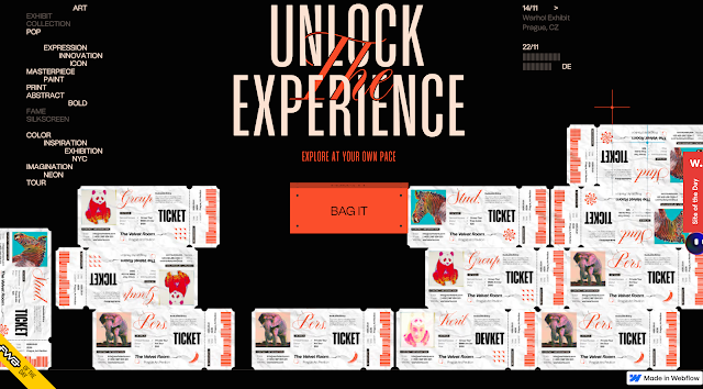 |
| Fig 1.4 Purchase page |
Quality and Performance:
This site uses a lot of images and animations that may slow down the loading speed for the user. The site is mainly visual and lacks text.
 |
| Fig 1.5 First Page |
Purpose and goals
As you can see from this page this is a site about oil, conservation, and protecting the environment.
Visual Design and Layout:
The design of this website is simple and clear, emphasizing the damage we are doing to the environment, using climate, economy, and health to tell us what plastic waste is doing to us.This website mainly uses black, white and red, the use of red is to warn people of the seriousness of environmental pollution, the purpose is direct and clear at a glance.
 |
| Fig 1.6 Content Page |
Functionality and Usability:
This site encourages users to participate in policies to protect the environment by providing data analysis on the environmental, economic and health impacts of plastics production.
 |
| Fig 1.7 Digital |
 |
| Fig 1.8 First Page |
The page starts with the line Turn your metal waste into revenue and inserts a picture of scrap metal, so that the user immediately understands what the site is about.
Purpose and goals
This is a website that focuses on the sustainability of metal fabrication by efficiently recycling metal scrap into reusable metals.
Visual Design and Layout
 |
| Fig 1.9 |
When presenting the content, it is preferred to present it to the reader in a progressive manner, one by one, individually. The design of the site is very modern, with a clean interface that focuses more on technical presentation.
Functionality and Usability
This website supports English and Japanese languages, so it can face more users. The content clearly expresses its high technology and clear regulations. It is more investor-friendly and allows you to quickly understand its technology.
The website has added an update stating that the site is continuing to do work on metal scrap conversion to make customers more aware of the program.
 |
| Fig 1.10 |
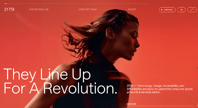
Purpose and goalsThis site is about the sports industry with the goal of making better equipment available to users.
Visual Design and Layout:
The site loads pages from 1 all the way to 21, in line with the site name 21 TSI.
The site uses a minimalist black and white color scheme combined with animation to give us a very cool visual effect. The website gives users a cool visual effect by scrolling the mouse.
 |
| Fig 1.11 |
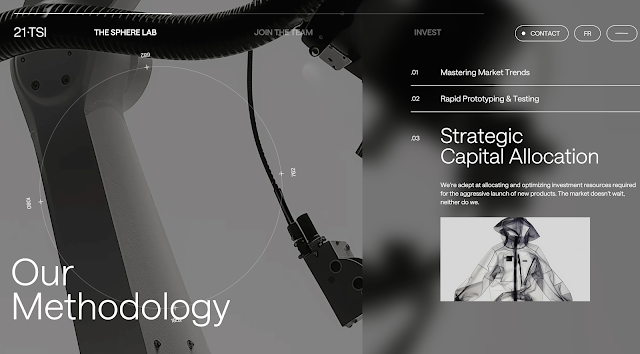
Functionality and Usability
The content of the website is well structured and hierarchical.
The introduction of the site is not detailed enough, the lack of interactive elements, you can put a little more customer use cases, demo video to let users understand more thoroughly.
Quality and Performance:
Due to the large number of animations and images used, the site may experience slow loading issues.
 |
| Fig 1.12 |
The first page of the website is able to zoom in and out to see these small balls, giving the user a certain sense of interactive experience.
Purpose and goals
This is a personal website that shows readers the results of their professional competence and projects.Covering gaming, social media, brand linkage and more, reflecting multi-disciplinary experience.
Visual Design and Layout:
The use of textured animation and the combination of graphics and text, presented in chronological order, is very creative.Clicking on each screen jumps to a new page to play the video.
 |
| Fig 1.13 |
Functionality and Usability
Focuses on what it says about itself, with no collaborative contact, get resume button.
This website shows the impact of the programs, the conversion rate, interaction and participation of each program, and it can be seen that this is a website with a lot of success stories.
Feedback


Comments
Post a Comment