30/4/2025-6/5/2025
Cai Zihan/0378043
GCD 60904 / Interactive Design / Bachelor of Design (Hons) in Creative Media / Taylor's University
Exercises 2
TABLE OF CONTENT
Instructions
Lectures
Exercise 2 Replicate a Website
Feedback
Reflection
INSTRUCTIONS
<iframe src="https://drive.google.com/file/d/1cRM_m5eErYToYALYb7Dm0RNrArnWh8I-/preview" width="640" height="480" allow="autoplay"></iframe>
Lectures
<iframe src="https://drive.google.com/file/d/14hjHSvBXsE3XXgP4r8PDdDaK4NtPONwG/preview" width="640" height="480" allow="autoplay"></iframe>
Exercise 2 - Web Replication
Your task is to replicate TWO (2) existing main pages of the websites that you have analyzed in Exercise 1 to gain a better understanding of their structure. Follow the dimensions of the existing website, including the width and height. This exercise will help you develop your design skills using software such as Photoshop or Adobe Illustrator and gain insights into web design best practices.
You can use any image from a stock image or a free stock icon. The image that you will be using does not have to be an exact image from the original website. You may replace it with a similar image. Focus on the layout, type style, and color style. To find similar typefaces/fonts, you can download fonts from Google Fonts. You may need to screengrab the website and can begin to replicate the page.
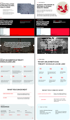
For the home page, I used the Gill Sans Ultra Bold font. And I made the red text in the bottom paragraph bigger, in order to appeal to people's desire to protect the environment even more.
For this one page, I've mostly changed the photos and fonts. For one of the pages, the original page was a direct paste of text, and I added a low transparency black square to that.
I changed the data graph on the original site, it was originally based on how many squares of data were used as a standard, and I changed it from that, I changed it to look like a line graph, and I thought that maybe this would allow the reader to see the variables more at a glance.
I have made some modifications to the original page.But didn't make too many changes, I just changed the images and fonts.
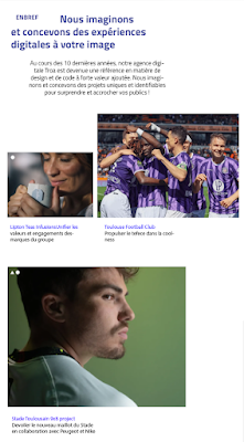
For this one homepage, I changed the image & font. I tried to mimic the feel of the original page, so I did a vignette blur. And cropped the original image below the waist to make it look more similar.
And changed the layout of the text a little bit so that it might look more comfortable, but it's not a huge change, and I still mimicked the original page with two or three fonts.
Outcome:
<iframe src="https://drive.google.com/file/d/1sHmnaZHaSPuuQugIWaPyWkO8_OoiZI6J/preview" width="640" height="480" allow="autoplay"></iframe>
<iframe src="https://drive.google.com/file/d/1AQBuuXpyS_pWb4h4uHWmSDRIgYwW8VmS/preview" width="640" height="480" allow="autoplay"></iframe>
Feedback
General Feedback:
Understanding Website Structure
1.Header:The header is the top section of a webpage.It usually contains the website's logo, navigation menu, and contact information.The header provides users with quick access to essential information and navigation.
2.Body:The body is the main content area of a webpage.It contains text, images, videos, and other multimedia elements.Proper organization of content within the body is crucial for readability.
3.Footer:The footer is located at the bottom of a webpage.It typically includes copyright information, links to important pages, and contact details.The footer provides closure to the webpage and additional navigation options.
Reflection
This week our teacher asked us to copy websites and create them using Ps or Ai software. I think this is a very helpful process to help us refine our use of PS and Ai.After making the pictures it took a lot of effort in compressing them due to too much memory.


Comments
Post a Comment