Typography Task 3: Type Design and Communication
1.11.2024-28.12.2024/week8-week10
Cai Zihan/0378043
Typography/Bachelor of Design (Honours) in Creative Media
Task3:Exercise1
TABLE OF CONTENTS
LECTURES
week 7:
Mr. Vinod summarized Task 2 for us and explained Task 3 Typography requirements.
week 8:
Independent Study Week
week 9:
At the end of the self-study week, Mr. Vinod singled out a few common misconceptions in our typography and gave a unified explanation, followed by individual explanations to each person.
week 10
The professor asked us to post the assignments we changed last week on Facebook, after which the professor changed every single one of them. The professor changed my work to be more organized and uniform and to look more comfortable.
INSTRUCTIONS
<iframe src="https://drive.google.com/file/d/1Ekk8F4rA19FVD_8k5DW_36hLs5cJcZiV/preview" width="640" height="480" allow="autoplay"></iframe>
week 7
Research
Before I drew my own fonts Wireless looked a little online for fonts designed by others.
 |
| fig.1.1 reserach |
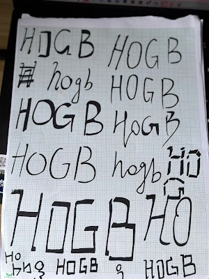
This is the typeface the professor had us design in class.
 |
| fig.1.2 sketches |
This is a hand-drawn font digitized for upper and lower case.
 |
| fig1.3 digital Hogb |
The first font has a digital breeze and uses squares and trapezoids in different sizes to assemble the letters.
The second font is a line added to the normally used font, which will feel like a minimalist style.
The third one also adds a kind of electric-like twist to the usual font.
 |
| fig.1.3.1 digital Hogb |
week 8
This is the process of profiling 'Hogb' and I chose the Bembo font to profile.
 |
| fig.2.1 self-analysis |
Hogb:I chose the Bembo font.
'H':Perfect left-right symmetry. However, its lower part is larger than its upper part, so it is not absolutely symmetrical.
'o':The circle inside is not a square circle, tilted at an angle. The outside circle is thicker on the left and right sides, and the inside circle is thicker on the top and bottom.
'g':The upper part consists of a flat “o”, while the lower part is much more complex, consisting of a number of ellipses that are the same length as the upper and lower parts.
'b':The “o” part of b is not a circle but an irregular ellipse.' The 'l' part is not just a straight line, there is an extra right triangle connected to 'l' at the top.
 |
| fig.2.2 sketch'oledsnchtig' |
 |
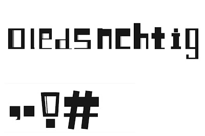
| fig.2.3 digital 'oledsnchtig' |
This week, Mr. Vinod explains to us in detail the problems that most of us encounter when designing fonts, such as the different sizes of letters causing them to take up different grids, and the fact that most letters are larger at the bottom and smaller at the top.
So I've made changes.
The first
 |
| fig.2.4 digital |
After
 |
| fig.2.4.1 modified |
 |
| fig.2.4.2 base line |
I created the baseline to make the font size look neater and more regular overall.
Here's the process of making the letters, and at the end I added a little bit of brushstrokes, just like handwriting.
 |
| fig.3.1 Step-by-step analysis of the production process |
I used the brush tool to make the font look more like it was written.
 |
| fig.3.2. brush tool |
 |
| fig.3.3 Step-by-step analysis of the production process |
 |
| fig.3.4. sktech |
 |
| fig.4.1 The final |
The professor helped me change a few things to make the overall look neater and more uniform.
 |
| fig.4.2. The final |
FINAL Task 3: Type Design & Communication
Download font there:
https://drive.google.com/file/d/1nvE1KEeGBHB584UKjfCe6glQDI1D7MWG/view?usp=sharing
Feedback
Week 8 (Independent Learning Week)
week 9
week 10
The professor asked us to post the assignments we changed last week on Facebook, after which the professor changed every single one of them. The professor changed my work to be more organized and uniform and to look more comfortable.
week 11 General Feedback:Work on the font design using AI is basically over. And some fine-tuning of the whole process, changing the length of the 'i' and the size of the punctuation.
REFLECTIONS
FURTHER READING
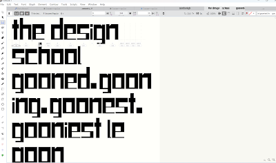
We put the fonts from the previous weeks into fontlab and tweaked them, and exported the fonts when the professor confirmed them.
 |
| fig.5.1 into fontlab |
WEEK 12
This week we need to make a poster using the font we systematized last week. Please make it black and white and do not change the font size.
 |
| Fig 6.1, Final Poster |
 |
| Fig 6.2, Final Poster |
<iframe src="https://drive.google.com/file/d/1fiuv4_SUtGtTzbQN6x4z3qgbJDgUd4jd/preview" width="640" height="480" allow="autoplay"></iframe>
Feedback
Week 8 (Independent Learning Week)
week 9
General Feedback:At the end of the self-study week, Mr. Vinod singled out a few common misconceptions in our typography and gave a unified explanation, followed by individual explanations to each person.Mr Vinod said that consistency in strokes and size are important to consider when creating typefaces. The entry and exit points of the strokes need to be maintained for all the letters but punctuation such as exclamation mark.
Specific Feedback:The professor pointed out the problems we had with last week's assignment. My font should go beyond the line, for example, the 'h' could be a little longer and the 'g' could be the same size as the 'o'. Where the line for 'n' was not placed on the left side like the other letters, it should be just as good.
The professor asked us to post the assignments we changed last week on Facebook, after which the professor changed every single one of them. The professor changed my work to be more organized and uniform and to look more comfortable.
week 11 General Feedback:Work on the font design using AI is basically over. And some fine-tuning of the whole process, changing the length of the 'i' and the size of the punctuation.
week 12
General Feedback:We put the fonts from the previous weeks into fontlab and tweaked them, and exported the fonts when the professor confirmed them.
REFLECTIONS
Experiences:
week 9
General Feedback:At the end of the self-study week, Mr. Vinod singled out a few common misconceptions in our typography and gave a unified explanation, followed by individual explanations to each person.Mr Vinod said that consistency in strokes and size are important to consider when creating typefaces. The entry and exit points of the strokes need to be maintained for all the letters but punctuation such as exclamation mark.
Specific Feedback:The professor pointed out the problems we had with last week's assignment. My font should go beyond the line, for example, the 'h' could be a little longer and the 'g' could be the same size as the 'o'. Where the line for 'n' was not placed on the left side like the other letters, it should be just as good.
Observations:
You can refer to other people's work online before each production, and then think about how you would make it yourself. You can sketch it on paper now before digitizing it.
Findings:
When designing your work, if you remember your idea, realize it as soon as possible. Drawing more than one can identify the best of them before improving them.
FURTHER READING
The vignelli canon
The Vignelli Canon is a booklet written by renowned Italian designer Massimo Vignelli to share his design philosophies and principles, with particular insight into the fields of graphic design and visual communication. Below is a reading summary of the book:
1. Core Ideas of Design: Syntax and Semantics
Semantics:
Fundamental to design is understanding the meaning of content. Every design should start with its function and meaning, not just formal aesthetics. Vignelli advocates that design must convey a clear message and have cultural depth.
Syntactics:
Syntactics is the visual language of design, including basic elements such as typography, grid systems, color, and proportion. These elements should be applied in a rigorous and orderly manner to ensure that the design is uniform and professional. 2.
2. Design Discipline: Grid Systems
Grid Systems is one of the key pillars of Vignelli's design methodology.
He believed that grids are not only tools, but also a way of thinking, used to organize the visual structure of a design so that information is clear and organized.
The grid system is flexible:
Although grids bring order, designers can adapt them to the needs of a project, both to follow the rules and to create individuality.
3. Typography (Typography)
Choice of fonts: Vignelli favors the use of fewer, more precise fonts. He prefers sans-serif fonts (such as Helvetica) because they are clear, concise and universally applicable.
The importance of consistency: Typography should maintain uniformity in font style and spacing to enhance the reading experience and brand recognition.
4. The use of color
Vignelli's view of color focuses on minimalism. He believes that there is no need for too many colors in design, black, white and grey are the most basic colors that can highlight the content itself.
Color needs to be used carefully to ensure that it enhances rather than distracts from the visual focus.
5. Integration of form and function
Vignelli believes in the natural derivation of form from function, rather than the pursuit of form and beauty at the expense of practical use.
Good design is a friend of time: it possesses classicism and stands the test of time rather than chasing ephemeral trends.
6. Ethics of Design
Designers have a responsibility to create meaningful and sustainable design, not to pursue short-term profit or sacrifice functionality.
Design not only serves the client, but also contributes to society and should be both aesthetically pleasing and responsible.
In Summary: Timeless Principles of Design
In its simple and clear language, The Vignelli Canon distills Vignelli's design philosophy: design should aim to be clear, concise and enduring, follow semantic and syntactic principles, and adhere to professionalism and ethics. Whether in graphic design, product design, or any other creative field, this book provides invaluable guidance.
Vignelli's design philosophy emphasizes the balance between rationality and aesthetics, and advocates professionalism and responsibility to create classic designs that will influence the future. This is not only a book about design techniques, but also a manifesto of design values.


Comments
Post a Comment