Task 3 Deveopment & Design
Design Principles GCD60804
Cai Zihan 0378043
Bachelor of Design (Honours) in Creative Media
Task 3 Task 3 Devlopment & Design(week 5-week 7)
TABLE OF CONTENTS
1.Lectures
2.Instruction
3.Task 3:Development & Design
4.Feedback
Instruction
<iframe src="https://drive.google.com/file/d/1nuaNNEvFt9OWX9W0ispNyj2uVe2gfi2X/preview" width="640" height="480" allow="autoplay"></iframe>
Task 3:Development & Design
Design Development
The sketch I chose was the second one.
 |
| Fig 3.1 sketch |
 |
| Fig 3.2 Refer |
This is my very first sketch for further painting with these elements.
 |
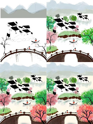
| Fig 3.3 Process |
This is the approximate painting process.
Since I wanted to further enrich this painting, I made changes in the composition. It was changed from a flat view to an overlook to enrich the picture.
 |
| Fig 3.4 |
 |
| Fig 3.5 |
 |
| Fig 3.6 <Cai Zihan_Spring_TASK 3> |
FINAL OUTCOMES
1.the decisions made in your design
Fig 3.6 is designed in the Chinese ink style, combining traditional and modern visual elements.
1.Theme
Enriching the picture with green, pink trees, you can see that everything is revived and spring is in full bloom.
3.Title
‘Spring’ has a gradient red colour, with transparency changes in the lower part of the font to blend it into the image.
4.Composition
The distant mountains and the hazy background give the image a sense of space and white space.
The architecture is a reference to the white-walled and black-tiled Huizhou-style buildings, which increase the sense of hierarchy from near to far and from big to small.
2.the mean of the design
In order to express the spring and vibrant scene in the spring of Jiangnan.
The word ‘Spring’ in the title gives an indication of the purpose of the diagram. At the same time, the subheading ‘Own the moment’ at the top wants to emphasise the idea of cherishing the moment, and wants the reader to pay more attention to and enjoy the beautiful time and scenery that spring brings.
3. the design principles that you are employed to create the design.
1.Contrast:Fig 3.6 in red is the focal point of the picture, using the design principle of contrast, with a sharp contrast in colour.
2.Word and Image:Fig 3.6 is in the style of a poster with added text so that the reader can better visualise what is being expressed.
3.Unity&Harmony:Fig 3.6 has an overall ink and wash style with soft colours, creating a harmonious image.


Comments
Post a Comment