Advanced Typography: Task 1 Exercises

 21/4/2025-24/7/2025(week 1-week 14)

Cai Zihan/0378043

GCD 61004 / Advanced Typography / Bachelor of Design (Hons) in Creative Media / Taylor's University

Task 1/Exercises


TABLE OF CONTENT

Instructions
Lectures
Exercise 1:TYPOGRAPHIC SYSTEM
Exercise 2:Type & Play
Feedback
Further Readings
Reflection


Instructions


<iframe src="https://drive.google.com/file/d/11r2eebFmM713T91NTxPwAy3-4AhLPqew/preview" width="640" height="480" allow="autoplay"></iframe>


Lectures

Week 1(21/4/2025):Typographic Systems

Week 2 (29/4/2025): Typographic Composition

Week 3:(5/5/2025):Context & Creativity

Week 4:(12/5/2025) : Designing Type

Lecture 01:Typographic Systems

8 Major variations:

  • Axial
  • Radial
  • Dilatational
  • Randon
  • Grid
  • Modular
  • Transitional
  • Bilateral

Fig 1.1 8 Major variations (week 1 21/4/2025)


1.Axial
All elements are organized to the left or right of a single axis.

2. Radial System
All elements are extended from a point of focus.

3. Dilatational System
All elements expand from a central point in a circular fashion.

4. Random System
Elements appear to have no specific pattern or relationship.

5. Grid System
A system of vertical and horizontal divisions

6. Transitional System
An informal system of layered banding.

7. Modular System
A series of non-objective elements that are constructed as a standardized unit.

8. Bilateral System
All text is arranged symmetrically on a single axis.


Lecture 02:Typographic Composition

Principles of Design Composition:
 1.Emphasis
 2.Isolation
3. Repetition
 4.Symmetry & Asymmetry
 5.Alignment 
 6.Perspective

The Rule of Thirds

The Rule of Thirds is a photographic guide to composition,it basicallysuggest that a frame (space)can be divided into 3 columns and 3rows.The intersecting lines are are used as guide to place the pointsof interest,within the given space.

Fig 1.2 The Rule of Thirds(week 2)


Other models/Systems

Environmental Grid:This system is based on the exploration of an existing structure ornumerous structures combined.


Fig 1.3 Environment Grid(week 2)


Form and Movement:This system is based on the exploration of an existing Grid Systems.Ideveloped this system to get students to explore;the multitude ofoptions the grid offer;to dispel the seriousness surrounding theapplication of the grid system;and to see the turning of pages in abook as a slowed-down animation in the form that constitutes theplacement of image,text and color.


Lecture 03:Context & Creativity

Handwriting
The professor explained to us a simple process of the world handwriting to printing to this current electronic world.
Fig 1.4 Context & Creativity(week 3)


An example was given
(Right)Baloo:A perfect blend ofpointy paws in a coat of fur,Baloois an affable display typeface byEk Type.A multi-script typeface,itis available in nine Indian scriptsalong with a Latin counterpart,thefamily is Unicode compliant andlibre licensed.

Fig 1.5 Context & Creativity(week 3)


Lecture 04:Design Type
Two reasons for designing a typeface:
Type design carries a social responsibility so one must continue to improve its legibility 
Type design is a form of artistic expression

1.Adrian Frutiger
Frutiger is a sansserif typeface designed by the Swiss type designer Adrian Frutiger in1968 specifically for the newly built Charles de Gaulle InternationalAirport in France.

Fig 1.6 Adrian Frutiger(week 4)


Considerations/Limitations:letterforms neded to be recognized evenin poor light conditions or when the reader was moving quickly pastthe sign.

2.Verdana by Matthew Carter
Verdana (1996)for Microsoft Purpose:the font was tuned to be extremely legible even at very smallsizes on the screen due in part to the popularity of the internet and electronic.

Considerations/limitations:The Verdana fonts exhibit characteristicsderived from the pixel rather than the pen,the brush or the chiselCommonly confused characters,such as the lowercase i j l.
Fig 1.7 Verdana by Matthew Carter(week 4)


3.Johnston Sans by Edward Johnston
Edward Johnston is the creator of the hugely influential London"Underground"typeface,which would later come to be knows as“Johnston Sans”(1916)
Fig 1.8 Johnston Sans by Edward Johnston(week 4)


General Process of Type Design:
1.Research

When creating typefaces, we should understand type history, type anatomy, and type conventions, as well as terminology, sidesteps, metrics, and hints.

It is important to determine the purpose or use of the typeface, e.g., whether the typeface will be used for school buses or airport signs, etc.

2.Sketching
Some designers sketch their typeface using the traditional tool set(brushes/pens,ink and paper)then scan them for the purpose ofdigitization.

Some designers sketch their typeface using digital tool sets.

3.Digitization
There are professional software that are used in the digitization oftypefaces,amongst the leading software are:FontLab and GlyphsApp

4.Testing
Testing is an important component in the design thinking process.The results of the testing is part of the process of refining andcorrecting aspects of the typeface.

5.Deploy
Even after the fonts are deployed, there will always be teething problems that were not noticed during the prototyping and testing phases.


Exercise 1:TYPOGRAPHIC SYSTEM
Content Details:
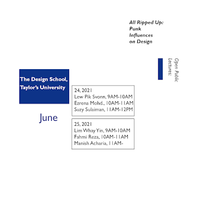
The Design School,
Taylor’s University

All Ripped Up: Punk Influences on Design
or
The ABCs of Bauhaus Design Theory
or
Russian Constructivism and Graphic Design

Open Public Lectures:
June 24, 2021
Lew Pik Svonn, 9AM-10AM
Ezrena Mohd., 10AM-11AM
Suzy Sulaiman, 11AM-12PM

June 25, 2021
Lim Whay Yin, 9AM-10AM
Fahmi Reza, 10AM-11AM
Manish Acharia, 11AM-12PM
Lecture Theatre 12


I choose All Ripped Up: Punk Influences on Design  for the title.

References

Fig 2.1 References

I looked up information about PUNK on the pinterest site. Combining the information I found out, I think punk is a very uninhibited style that wants to break the mold. And it gives a sense of power and a strong purpose of wanting to break the mold.

So in my design I will focus on expressing the feeling of power, uninhibited.


Sketches
Fig 3.1.1 Sketches of 8 Major variations(week 1,25/4/2025) 


1.Axial


Fig 3.1.2 Axial System(week 1,25/4/2025)


Bmbo Std(Bold,Italic)


Fig 3.1.3 Fianl of Axial System(28/4/2025)


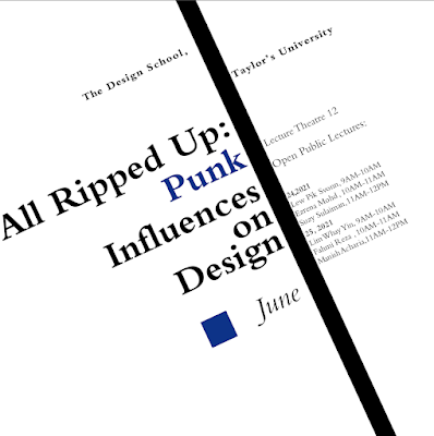
For the axial system, I tried to use a horizontal line. The first image makes it look regular, the second image I made the ‘punk’ look wilder by changing it to an upward slant.

For the first image I followed the sketch I drew, but to optimize the layout even more, I added graphics, and rotated the text box at an angle. So, for the second image, I drew a slash.

2. Radial System

Fig 3.1.4 Radial System(week 1,25/4/2025)


Use font:ITC Garamond Std(Ultra Condensed Italic,Light Condensed,Ultra Condensed)

For radials, I use two circles mainly as a base. I increased the size of the ‘punk’ font and changed the font shape to make the reader see the point at a glance.

3. Dilatational System


Fig 3.1.5 Dilatation System(week 1,25/4/2025)


Fig 3.1.6 Final of Dilatation System(week 1,28/4/2025)


ITC Garamond Std(Bold,Ultra Condensed)

For the expansion system, I first searched the internet to learn how to create a way to enter text along a path. Then I kept tweaking the typography. First I made it as I originally sketched it, but it didn't come out well, so I reorganized the text.


4. Random System
10 fonts


Fig 3.1.7 Random System(week 1,25/4/2025)

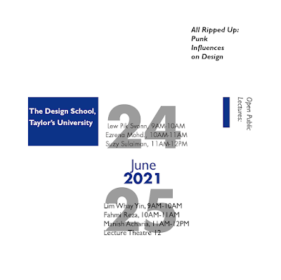
For the randomization system, I've just gone with the literal random ordering, but then I've made some of the important information eye-catching in order to make the content more readable.


5.Grid System

Fig 3.1.8 Grid System(week 1,25/4/2025)


Bembo Std

For the grid system, I divided the page into a 2×2 grid , and added two squares so it looks neater.

6.Transitional System

Fig 3.1.9 Transitional System(week 1,25/4/2025)


Fig 3.1.10 Final of Transitional System(week 1,25/4/2025)

ITC Garamond Std(Ultra Condensed,Ultra Condensed Italic)

For the transition system, the first image I followed my sketch, but it didn't look very neat and nice, so I changed the style to make this system using a stepped form with a gradient.


7.Modular System
Fig 3.1.11 Modular System(week 1,25/4/2025)

Fig 3.1.12 Final of Modular System(week 1,28/4/2025)


Gill Sans MT(Italic,Bold Italic)
Futura Std

For the modular system, I used squares for this. I divided the page into a 3×3 look with different styles of text placed inside, but strictly in 3×3 modules.

8. Bilateral System

Fig 3.1.13 Bilateral System(week 1,28/4/2025)

Futura Std(Extra Bold Oblique,Light Oblique

For bilateral systems, the definition is that all texts are symmetrically aligned on a single axis. So I drew a line down the center of the page. And tweaked a little on top of that to make it look more regular.


Final Outcome


Fig 3.1.14 Fianl of Axial System(30/4/2025)


Fig 3.1.15 Final of Radial System(week 1,30/4/2025)


Fig 3.1.16 Final of Dilatation System(week 1,30/4/2025)


Fig 3.1.17 Random System(week 1,30/4/2025)


Fig 3.1.18 Grid System(week 1,30/4/2025)


Fig 3.1.19 Final of Transitional System(week 1,30/4/2025)


Fig 3.1.20 Final of Modular System(week 1,30/4/2025)


Fig 3.1.21 Final of Modular System(week 1,30/4/2025)


Exercise 2 — Type & Play Part 1 / Finding Type

In this exercise, the professor had us make fonts by extracting letters from photographs. I chose a leaf to make my font.


Fig 4.1 Leaf (week 3)


Fig 4.2 Excerpted letters(week 3)


I excerpted ‘ABCEH’ from the chart

Fig 4.3 EXcerpt ‘ABCHE’(week 3)


To round out the font, I chose Brush Script MT Italic as my reference font.


FIg 4.4 Choose font(week 3)


Fig 4.5 Progress (weeek 3 )
My professor said my font selection wasn't very good, so I reused this image to make a new font, and the professor gave me a suggestion.

Fig 4.6 Teacher's advice(Week 3,7/5/2025)

Figure 4.6 shows the suggestion my teacher gave me during class: to use the shape of leaves to create a font.


Fig 4.7 New Fonts (Week 3,7/5/2025)


My professor suggested that I use the shape of a leaf for the font, rather than the rhizome in the leaf.
Here's the process I went through to make it, and I ended up picking the font for the third line to make a poster.


Fig 4.8 Poster (Week 3,7/5/2025)
Here's the poster I made. One of the images I selected was not placed directly on the whiteboard.

Fig 4.9 Progress of Poster (Week 3,7/5/2025)

I used the lasso and masking tools to place the leaves in an interspersed form into this poster, which I think looks more alive, and added shadows under the leaves sticking out to look more realistic.


Fig 4.10 Modified(Week 3,7/5/2025)


Feedback
Week 1
General Feedback:In this week, Mr. Vinod gave us a brief overview of MIB and explained it carefully. After we were given time to watch the video provided and update our portfolios.

week 2
General Feedback:Mr. vinod critiqued our homework in class.It also explains the requirements for assignments that need to be turned in for the next week.
Special Feedback:The professor said to pay attention to whether or not the content is legible and to pay attention to the white space.

Week 3:
General Feedback:The professor reviewed the homework we did last week.And we presented our homework for next week.
Special Feedback:The professor said that the picture I chose had a lot of rhizomes and that what I chose wasn't really suitable for a font, so I made a new one. And the professor gave me the advice to not use the shape of the rhizome inside the leaf, but to use the shape of the leaf for it.

Week 4:
General Feedback:The professor commented on the poster assignment we did last week and explained the requirements of Task2. And tell us the ddl of task1
Special Feedback:The professor asked for appropriate white space for the poster


Further Readings
week 1:
Fig 5.1


 A Type Primer by John Kane.
 It focuses on helping students understand and apply the basic principles of typography.

Basics of Typography: It covers fundamental knowledge such as measuring type and classifying typefaces, enabling readers to have a basic understanding of the elements of type.This book is very detailed and nuanced in its explanations.


Fig 5.2


week 2

Page Layout and Organization: The book explains how to organize text on a page and understand grid systems, offering guidance on creating aesthetic and readable page layouts.

Examples and Exercises: There are numerous examples in the book to illustrate key points, and a series of useful exercises are also provided to help readers put the basic principles into practice, improve their practical ability, and strengthen their typographic instincts.

Fig 5.3


week 3
Fig 5.4


Typographic Design: Form and Communication, 6th Edition by Rob Carter

This book is about:The Evolution of Typography,The Anatomy of Typography,Legibility,The Typographic Grid,Syntax and Communication,The Typographic Message,The Evolution of Typographic Technology,Typography on Screen,Typography in Time and Motion,Case Studies in Typographic Design,Typographic Design Education,Typographic Design Process,Type Specimens.


Reflection
Experiences:
I learned and reviewed a lot through the assignments I did during this time. I reviewed what I learned in Indesign and became more skillful in applying it, maybe the design is not very good, but I learned a lot, and I can open my mind more by evaluating the assignments by the teacher and other students' assignments in class.

Observations:

During this period of study, I realized that I might not be particularly talented at producing beautiful work, so I searched online for many excellent pieces to read, study, observe, and even draw inspiration from, in order to do my best.

Findings:

Fonts are diverse and colorful, and everyone has different preferences, which has led to the creation of a wide variety of fonts. Designing fonts requires a lot of attention to detail and careful consideration. Creating posters also requires aesthetic training, which can be gained by looking at and observing many different examples.


Comments

Popular posts from this blog

Interactive Design / Project 1/Exercises 1

Typography Task1/Exercise

Advanced Typography /Task 3:Type Expression and Application