ADVANCED TYPOGRAPHY: TASK 2 KEY ARTWORK & COLLATERAL
12/5/2025 - 15/6/2025 / Week 4 - Week 8
Cai Zihan / 0378043
Advanced Typography / Bachelor of Design in Creative Media / Taylor's University
Task 2: Key Artwork & Collateral
TABLE OF CONTENTS
1. Lectures
2. Instructions
3. Task 2 (A): Key Artwork
4. Task 2 (B): Collateral
5. Feedback
6. Reflections
7.Further Reading
LECTURES
 |
| Fig 1.1 Contrast(week 5,19/5/2025) |
 |
| Fig 1.2 7 kinds of contrast(week 5,19/5/2025) |
The Law of Similarity is a Gestalt grouping law that states that elements that are similar to each other tend to be seen as a uniform group. Similarity can refer to any number of features, including color, orientation, size, or motion.
<iframe src="https://drive.google.com/file/d/11r2eebFmM713T91NTxPwAy3-4AhLPqew/preview" width="640" height="480" allow="autoplay"></iframe>
Task 2 (A): Key Artwork
Instruction:
- Create a wordmark/lettering of our own first name/pet name/pseudonym — minimum 4-5 character.
- Explore and compose as many permutations and combinations of your name in the form of a wordmark.
- Final key artwork must be an elegant solution, well balanced and composed, not complicated or confusing that leads to a functional and communicate key artwork.
Mind-Map
 |
| Fig 2.1 Mind-Map(week 5,20/5/2025) |
The professor asked us to select our own keywords using our mind maps.
The keywords I chose are: sharp and brave.
These are some references I found:
 |
| Fig 2.2 References(week 5,20/5/2025 |
I designed a few text logos based on your reference.
 |
| Fig 2.3 Moodboard(week 5,24/5/2025) |
In class, the teacher evaluated the logo fonts we had created. The teacher's suggestion to me was to make the spacing between each letter consistent and align them on the same straight line.
 |
| Fig 2.4 Class schedule adjustments(week 6,26/5/2025) |
In the end, I chose to design a hand-drawn style logo font and combined the above designs. This is my final design:
 |
| Fig 2.5 Final Design(week 6,27/5/2025) |
This is the color palette I chose.
 |
| Fig 2.6 color palette(week 6,28/5/2025) |
I used Adobe Illustrator to separate the 's' part of this font and wanted to create a water ripple and water reflection effect.
 |
| Fig 2.7 Cut's'(week 6,1/6/2025) |
 |
| Fig 2.8 water ripple(week 6,1/6/2025) |
However, the results were not ideal, so I made some changes to the separated parts.
Finally, I made the following changes below the 's' and added some decorations next to the 'ribbon'.
 |
| Fig 2.9 Combining water ripples and 's'(week 7,5/6/2025) |
Combine fonts with ribbons.
 |
| Fig 2.10 Final(week 7,5/6/2025) |
 |
| Fig 2.11 animation(week 7,7/6/2025) |
Begin Task 2B collateral (3 items), expand your key artwork with the knowledge gained today.
• Expand your key artworks identity into your chosen collateral.
• For inspiration view Pentagram site and study how identities are expanded.
Base image — rectangle/circle — convert to smart object — vanishing point — transform — add image to appropriate position — save — adjust — export.
To make it more realistic, I added shadows with a brush and adjusted the blending mode and opacity.
The paper bag was originally white, but I used Photoshop to change its color to pink, then changed the front of the bag to white, and added the logo and other decorations.
 |
| Fig 3.1 Paper bag Progress(week 7,6/6/2025) |
 |
| Fig 3.2 Paper bag(week 7,6/6/2025) |
 |
| Fig 3.3 Badge Progress(week 7,6/6/2025 |
 |
| Fig 3.4 Badge(week 7,6/6/2025) |
 |
| Fig 3.5 Clothes(week 7,6/6/2025) |
The image on the left is the original photo. I converted it to black and white and added the logo to the photo. I covered the ribbon on the letter “s” to create a winding effect.
 |
| Fig 3.6 black-and-white photograph(week 7,7/6/2025) |
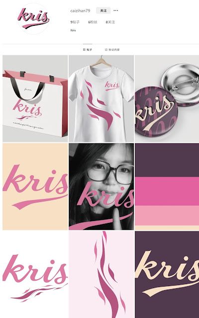
Instagram Link:instagram.com/caizihan79/
 | ||||
| Fig 3.7 Instagram | (week 7,7/6/2025) |
 |
| Fig 3.9 Badge(week7,7/6/2025) |
 |
| Fig 3.10 Clothes(week7,7/6/2025) |
Task 2 Outcome Compilation
 |
| Fig 4.1 White wordmark on black background, Week 7 (10/06/2025) |
 |
| Fig 4.2 Black wordmark on white background, Week 7 (10/06/2025) |
 |
| Fig 4.3 Colour Palette,Week 7 (10/06/2025) |
 |
| Fig 4.3 Wordmark in actual colours on lightest shade of colour palette,Week 7(10/06/2025 |
 |
| Fig 4.4 Wordmark in lightest shade of colour palette on darkest shade of colour palette, Week 7(10/06/2025) |
 |
| Fig 4.5 Key Artwork Animation, Week 7 (10/06/2025) |
Fig 4.6 Task 2A PDF Compilation, Week 7 (10/06/2025)
 |
| Fig 4.7 Collateral 1, Week 7 (10/06/2025) |
 |
| Fig 4.7 Collateral 2, Week 7 (10/06/2025) |
 |
| Fig 4.7 Collateral 3, Week 7 (10/06/2025) |
 |
| Fig 4.8 Instagram Feed Design Layout, Week 7 (10/06/2025) |
Instagram Link:instagram.com/caizihan79/
 |
| Fig 4.9 2 Screenshot of Instagram page, Week 7 (10/06/2025) |
Feedback
Experience:
In this task, the professor asked us to write a mind map to find our own keywords, design our own logo using our keywords, change colors using a color palette, and then create brand extensions and post the actual products on Instagram.
Observation:
When searching for keywords to describe myself, many words came to mind, but none of them accurately described me. I spent a lot of time creating the dynamic animation for the logo. At first, I designed many logos, but I wasn't satisfied with any of them. In the end, it was only after looking at more materials and other people's work that I was able to design the final piece.
Findings:
Through this task, I learned how to create a logo and apply it to actual objects. It is a very meticulous process, as the color combination, font size, and spacing all determine success or failure.
Further Reading
 |
| Fig 5.1 |
 |
| Fig 5.2 |


Comments
Post a Comment